
Font hinting

Hinting, or screen optimising, is the process by which TrueType or PostScript fonts are adjusted for maximum readability on computer monitors. This text compares different ways of hinting (black & white, grey-scale, ClearType, DirectWrite), and explains the behaviour of fonts under different rasterisers.
Hinting, or screen optimising, is the process by which fonts are adjusted for maximum readability on computer monitors. I have been designing type since the early 1990s, and for as long as I can remember, type designers have been saying that hinting would soon be made obsolete by new advances in hardware and software. Now, almost 20 years later, hinting seems to be more relevant than ever.
The problem is that typical modern fonts are not designed primarily for the 72–96 dpi resolution of computer screens, but for the much higher 1,200+ dpi resolution of print media. The letterforms are designed and stored as outlines, mathematically perfect lines and curves which look great at high resolutions, but can be distorted or even illegible when converted into groups of pixels, the on-or-off dots that make up a computer’s display. And although there has been much discussion about high-definition computer monitors for decades, the fact of the matter is that my 5 year old mobile phone still takes photos with finer detail than my brand new computer can show on its screen.
This is the reason that webpage designers have long been more or less limited to a dozen or so fonts (Verdana, Georgia, Arial, etc.) that have been fine-tuned by hand so that typical text sizes (9–14pt) display well at low resolutions. These fonts are so common that most computer users think of them as free, but the reality is that Verdana, for example, is probably the most expensive, labor-intensive font ever produced. It includes characters used to write an extremely wide range of languages, and each of these characters had to be adjusted to be readable at every point size between 9 and 60 (at 60pt the resolution is sufficient to display the letterforms accurately). In other words, each of more than 890 characters was ‘redesigned’ dozens of times, once at every point size.
! wide hinting Fedra Sans before rasterisation, on the left, and hinted version of Fedra Sans Screen, modifying the original outline to fit the grid of the computer screen. Outlines of Fedra Sans Screen at various sizes. Notice how different the outlines are in order to achieve the optimal legibility of screen. Every letter is basically designed for each point size again.
This is exactly what hinting is about: programming instructions that fine-tune a font’s rasterisation, the process by which its mathematically ideal outlines are mapped onto a monitor’s pixels. Hinting can control the heights and widths of a font’s uppercase and lowercase letters, the widths of its individual lines, the amount of white space around letters, the size at which uppercase letters start to use different stem-widths from lowercase letters, how the angle of italic characters changes to best fit the pixel grid, and many other extremely technical details, all on a pixel-by-pixel basis. If this sounds like a rather tedious, time-consuming activity, it is, (even for type designers, who are accustomed to tedious, time-consuming activities).
Last year there was considerable hype about the @font-face declaration, a function that makes it possible for a webpage to display any font, freeing designers from dependence on the ‘web-safe’ fonts and opening new design possibilities (not the least of which is the creation of visual identities which are consistent across both print and web media). On the other hand, this also raises new issues, including poor onscreen display of non-hinted fonts. And because hinting is tedious, time-consuming and widely believed to be nearly obsolete, 99% of all fonts, even commercial ones, are non-hinted.
Hinting TrueType and PostScript fonts
Even when fonts are hinted optimum onscreen results are still not guaranteed, as different font technologies approach hinting differently. In the PostScript system most of the font scaling is handled not by the fonts, but by the rasteriser software, so fonts in PostScript format look often good with relatively simple hinting or no hinting at all. In the TrueType system, however, the rasteriser is controlled by sophisticated hinting instructions contained within the font software; without this information TrueType fonts do not display well onscreen.
Both systems have advantages and disadvantages. One advantage of the PostScript system is that the ‘intelligence’ is concentrated in the rasteriser, so any improvement to the rasteriser immediately produces better rendering of all PostScript fonts. Even 20 year old fonts render nicely on the latest Mac. In the TrueType system, rasteriser updates require all fonts to be updated as well for optimal results. Thus fonts hinted for black and white or greyscale rendering will not work as well with Windows’ ClearType rasteriser. On the other hand, TrueType hinting provides direct, pixel-by-pixel control over the rasterising process, which PostScript hinting does not.
Mac OS vs. Windows
A lot has been written about how Mac OS renders text compared to Windows. I will not go into details here, but the primary difference is that Microsoft’s rasteriser tries to align characters to whole pixel grid, with the result that ‘Regular’ weights look lighter, ‘Bold’ weights look heavier, and subtle details of design can be lost at small point sizes. Apple’s rasteriser tries to preserve the design of the typeface as much as possible, sometimes at the cost of image clarity. Windows’ rasterising software produces extremely good results with a few built-in TrueType fonts, but sub-optimal results with 99% of other typefaces. The Mac OS Quartz technology ignores font hinting completely and renders all fonts equally well regardless of their font format.
So let’s focus now on Windows — this is where hinting makes a difference — and let’s focus on TrueType fonts, which look superior in Windows at the moment.
Hinting Black and White rendering (Grid-Fitting), 1-bit
Black and white hinting, developed in the days when operating systems could only turn pixels on or off, controls which pixels will be displayed at a given point size. This kind of hinting is called grid-fitting because the outlines of the font are significantly modified to fit the pixel grid of the screen. It is the most time-consuming hinting process, and it takes an experienced hinter at least 80 hours to hint a single font with the basic 256 character set. Fonts with extensive character sets and/or numerous styles of course take much longer. This process also usually adds white pixels between characters to improve legibility, which can create a difference in length between printed and screen versions of a text. Microsoft’s Verdana and Georgia are examples of black and white hinted fonts. Newer technology has made black and white hinting obsolete and permitted onscreen results that are much truer to the original letterforms.


Hinting for Grey-scale rendering (Horizontal and Vertical), 4-bit or 8-bit
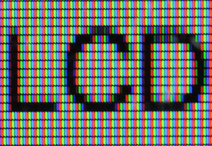
Anti-aliasing is a technique that was introduced in Windows 98. It smooths visibly jagged lines by using varying shades of grey to render type on screen, so instead of being limited to only black or white pixels, the rasteriser can also choose to compromise between them.
When hinting fonts for grey-scale rendering, characters don’t need to be forced into precise pixel positions. Characters are modified both horizontally and vertically, but using fewer instructions. Greyscale hinting is almost as time-consuming as black and white hinting, and a hinter typically spends 72 hours hinting one font of 256 characters. If you use CRT monitors, those bulky boxes from the 1990s, then greyscale hinting is the best you can get.


Hinting for ClearType rendering (Horizontal Only)
ClearType is a Microsoft proprietary subpixel rendering technology. It attempts to improve the appearance of text on flat-panel monitors by using the fact that every pixel is made from three elements which can be controlled separately. ClearType takes advantage of the way your eyes perceive colour, using shades of blue, red and green to simulate higher screen resolution.
This means that text resolution can be three times greater, but only horizontally. That also means that in ClearType hinting, characters are not adjusted along the vertical axis, which effectively halves the amount of work. A single font of 256 characters takes about 40 hours to hint.


Hinting for DirectWrite rendering (Horizontal and Vertical)
Windows 7 ships with a new font rasteriser, DirectWrite. It uses ClearType sub-pixel text rasterising, but applies anti-antialiasing both horizontally and vertically. This means that curves look smoother than with the ClearType rasteriser. Hinting is the same as for normal ClearType. The most dramatic change with DirectWrite is that it also improves rendering of OpenType fonts with PostScript outlines. DirectWrite replaces the older GDI rasteriser, and will work in Internet Explorer 9, as well in an as-yet unspecified future release of Firefox.


Practical Implications
What does all this mean to a type designer? Hinting can improve the rendering of fonts. But those fonts will be rendered differently by different rasterisers on different platforms and often in different applications as well, (compare for example text in the Safari and Explorer browsers on the same Windows computer). If the designer’s intention is consistent cross-platform rendering, the fonts also need to use consistent design across similar letters.
It is clear that one day font hinting will finally become obsolete, but it is not clear when that day will come. The most widely used operating system in the world, Windows XP (still 58.4% market share, as of this writing), has ClearType turned off by default, so unhinted fonts typically do not display well at small sizes. Whether we like it or not, it looks like hinting will be around for quite some time. But if you like how fonts display on the Mac at small sizes, you can take that as proof that it is already possible to render text well without any hinting at all.